

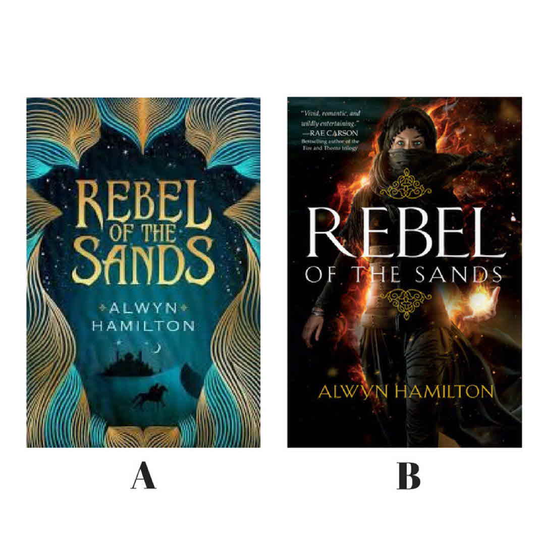
When the first cover came out this was an auto buy. It screamed read me! Then book 2 cover was released and a compleat change, with a change for book one cover. In another boom group this was a highly debated topic. One person even said that the original cover was stereotypical and racist. But I think that distinction belongs to the newer cover. Thoughts?
#coverlove #changesedition
TrishB B looks more stereotypical.... 8y
julesG I wouldn't buy B. It sends negative vibes. Yes, maybe racist vibes. Whereas the first cover has this Arabian Nights, stories and oriental exotic vibe. 8y
Lynnsoprano I agree with you. The first cover is definitely eye catching. The second would make me think twice if I were judging by the cover. It seems to play to stereotypes. 8y
See All 22 Comments
LibrarianRyan @Lynnsoprano @julesG I thought so too. Hate the new covers which has made me not read the series yet. 8y
jfalkens I like A much better 8y
DeborahSmall I don‘t think either cover is racist or stereotypical. If there was a book cover with a guy dressed in khakis wearing a hat and gun holster it would never be considered stereotypical. Based purely on aesthetics/personal preference I love cover A and I‘m planning on buying it 💕 8y
GlassAsDiamonds Is this a cover change or a country one? I‘ve got a new release of the second book in the cover style of the first? (I like the style of A so much better I must say. This whole “must have picture of heroine on cover” thing is slightly annoying). 8y
TsundokuAleax I was so mad when the new cover style was announced. My brother and I were at a book store a few weeks back when I showed him the change. Thankfully he is a smart one and agreed with me. On the plus side, if you are willing to do the work of locating and paying for it, they are still using the old style in the UK. So far I have the first book. 8y
LibrarianRyan @TsundokuAleax I saw that. But I would only find it in paperback. 8y
LibrarianRyan @GlassAsDiamonds these are a cover change for the American covers. Some countries have both editions look like a some countries both editions look like b. 8y
TsundokuAleax @LibrarianRyan totally get that. I sometimes get picky about which version I have (cover art and hardback vs paperback) 8y
Leniverse Cover A looks great. Cover B looks like a video game. 8y
ReadingRover I like A 8y
Itchyfeetreader I bought this based on cover A - not my usual read but I really enjoyed it. He cover looks inviting you just want to jump in ! 8y
SandyW @Leniverse My thoughts exactly! 8y
Skyrimir I like the first one. I don‘t generally like pictures of characters on the cover. I want to imagine what they look like. 8y
GlassAsDiamonds @LibrarianRyan ahhh. That explains it - I‘ve seen the covers in India & the states. India is A, the US was B. 😊😊😊 #expatproblems !! 😊😊 8y
2BR02B B just looks like Throne of Glass with a palate swap. 8y
LibrarianRyan @2BR02B I never thought of that, but now that you said it, I see it. 8y
Cailey_Mac I think they‘re both gorgeous, but as I think about it, I can see how the original cover might be seen that way. 8y
Kar2b The UK version kept with the Book 1 abstract design. I like it so much better! 8y
JoRead Never thought the first one as racist, I still don't think it is. However it looked boring to me. Call me shallow but I wouldn't pick up the book to read the blurb on the cover alone 😅 New one however looks very modern and oh, so kick-a$$ rebel. Yep, I'd read that in a heartbeat 😄 8y