


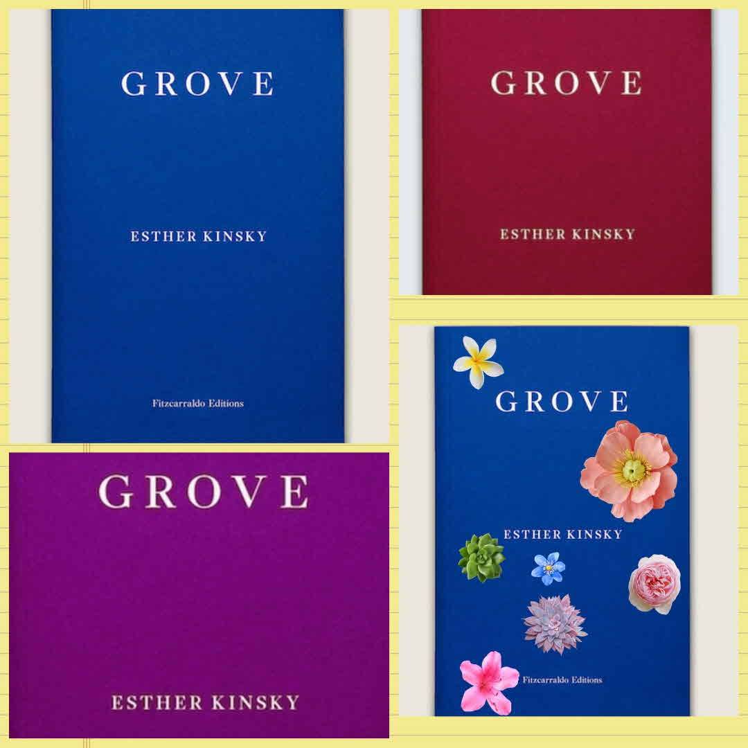
I feel like the publisher could mix it up a bit from the plain blue...
rockpools I agree! 4y
charl08 @rockpools the US cover is so much nicer. 😫 4y
rockpools @charl08 I hadn‘t seen that - it is much nicer. I felt that way about Hurricane Season. I know the blue is cool and stylish and what-have-you (not to mention cheaper) but they look like academic journals to me, which doesn‘t necessarily shout ‘read me.‘ I‘m obviously v shallow! 4y