Home Feed
Home
Search
Search
Add Review, Blurb, Quote
Add
Activity
Activity
Profile
Profile
Art of John Harris: Volume II - Into the Blue
Art of John Harris: Volume II - Into the Blue | John Harris
6 posts | 1 read | 1 to read
This second volume from Titan Books is a collection of world-renowned visionary artist John Harris' unique paintings captures breath-taking, otherworldly vistas on a massive scale. The Art of John Harris II: Into the Blue is the third collection (second collection published by Titan) of world-renowned visionary artist John Harris' unique paintings that capture future worlds on a massive scale, from vast landscapes and towering cities to breath-taking vistas. Readers will get a unique insight into the creative process behind the worlds depicted in the paintings as Harris takes them on a journey from sketch to finished painting, as well as his striking covers for a variety of esteemed science fiction authors, including John Scalzi, Ben Bova, Jack McDevitt, Orson Scott Card, Ann Leckie and many more.
Amazon Indiebound Barnes and Noble WorldCat Goodreads LibraryThing
review
Robotswithpersonality
post image
Pickpick

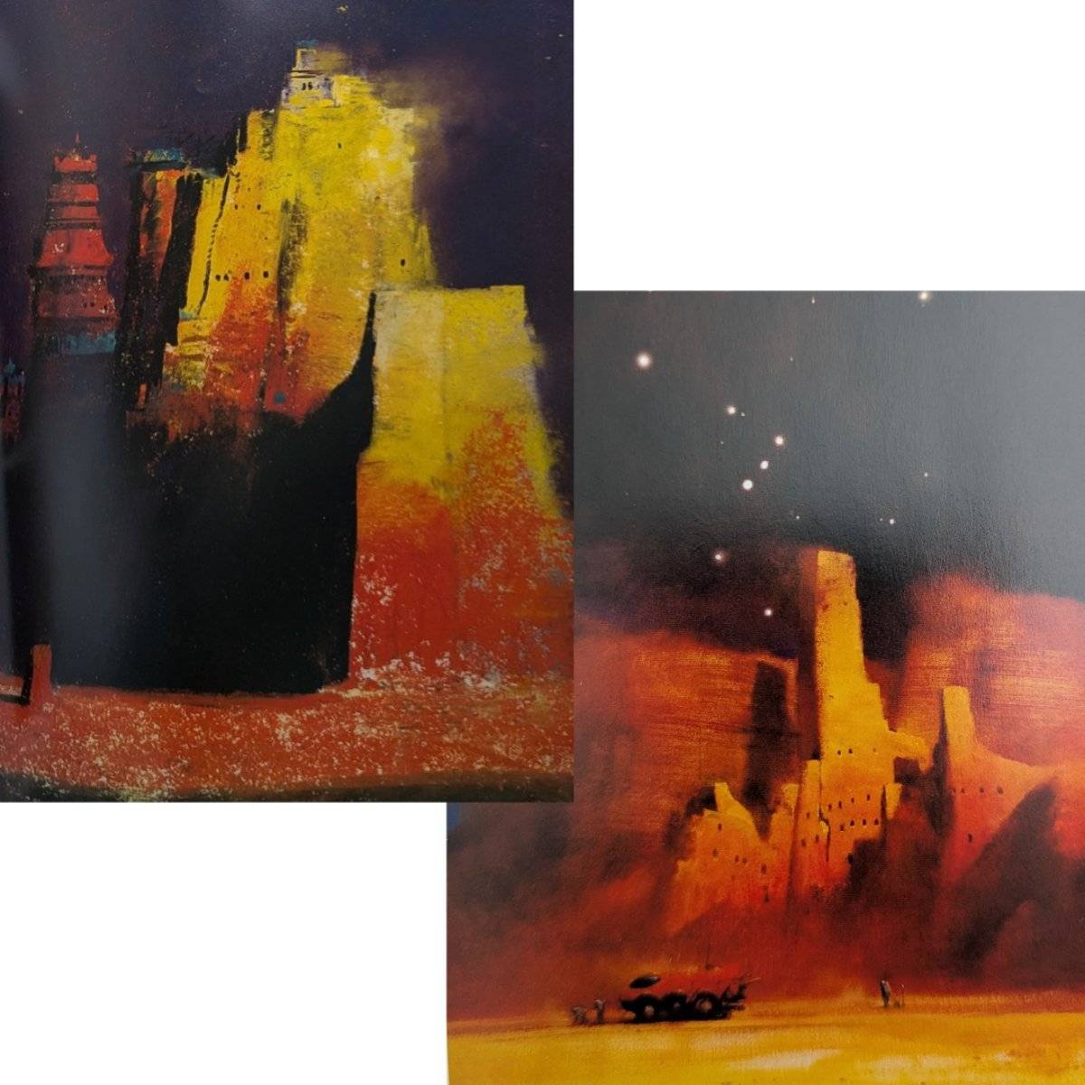
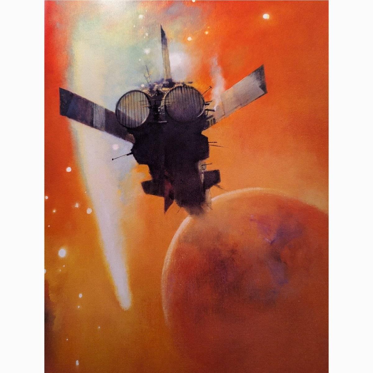
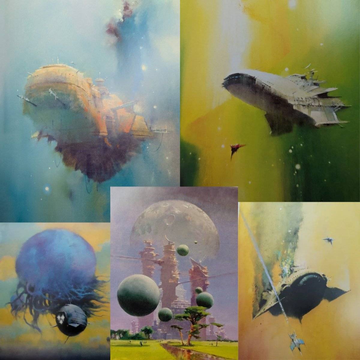
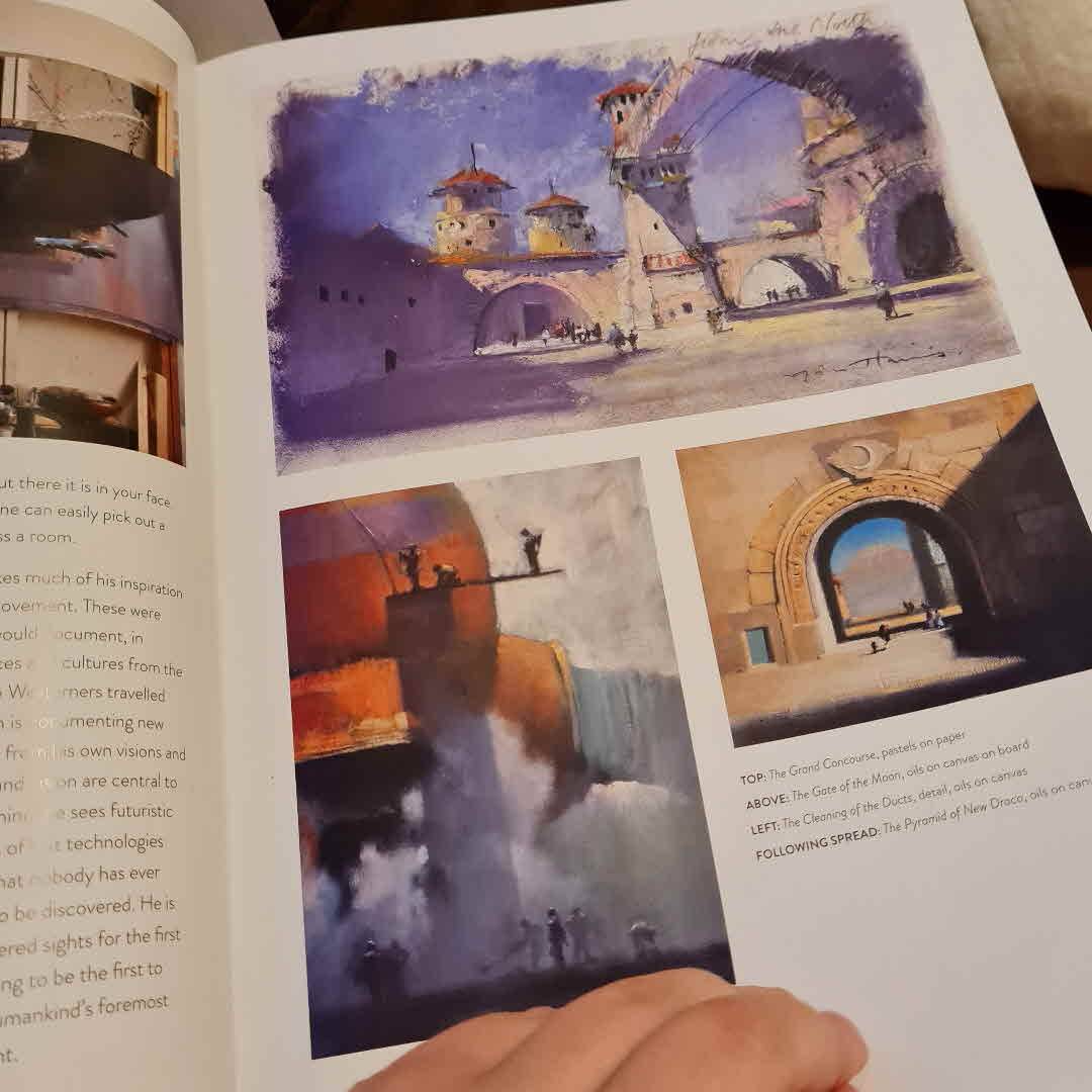
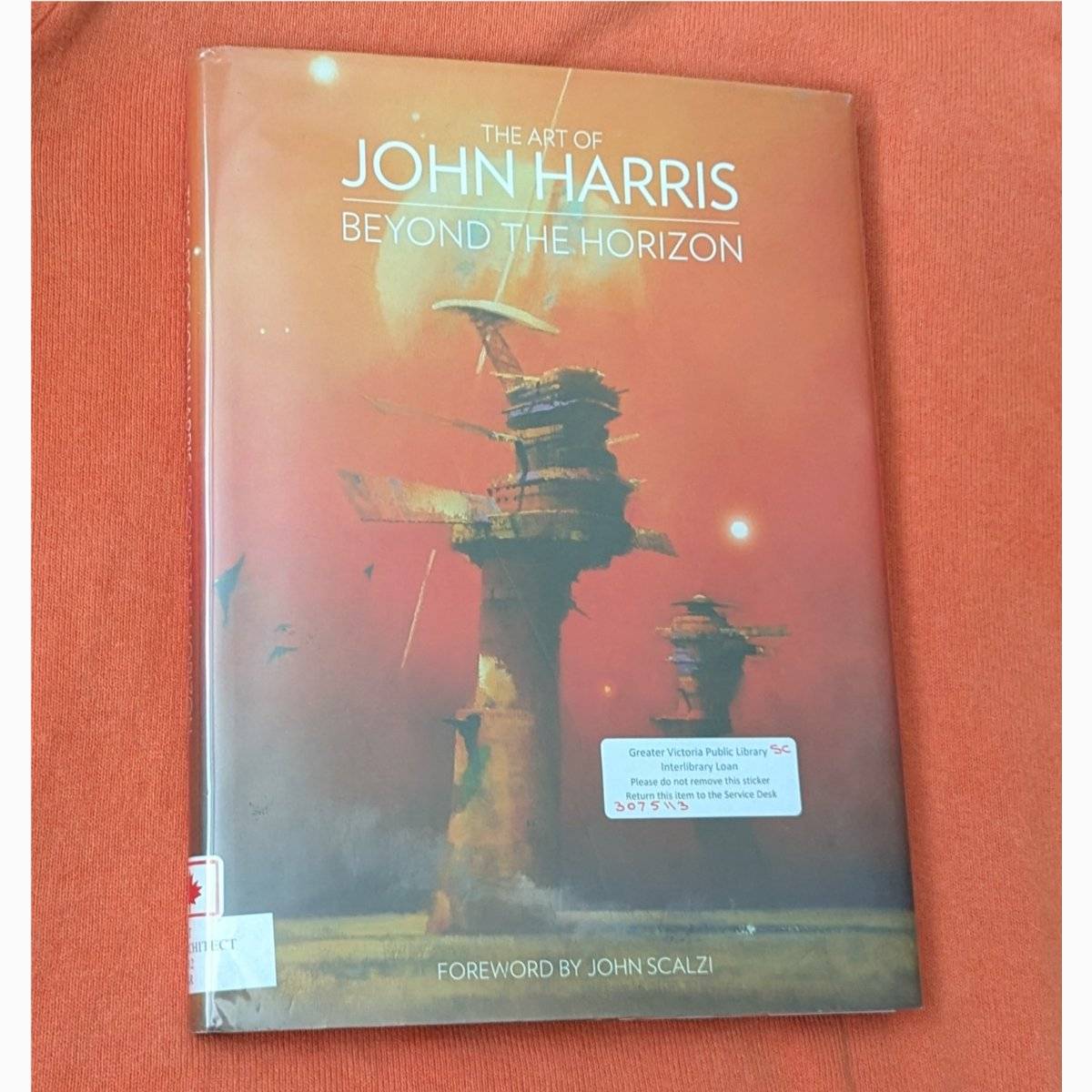
If I had a coffee table, this would definitely be on it. This book indicates that there are variations in Harris's style, not all pieces are the same carefully-coloured, impressionist brush-stroke versions of sci fi scenes shown to such great effect on John Scalzi's Old Man's War series book covers.
A large portion of the art in this collection is similar in style however, and surprise, all are my new favourites.
1/?

Robotswithpersonality 2/3 I'll admit, as opposed to the balance between text and image that was the 70s sci fi art book I read recently, this is majority image, and perhaps because it wasn't nifty trivia and history, I am of the subjective opinion that the few artist reflections, and the extended storytelling in the latter third don't add as much to the book. To each their own. 5d
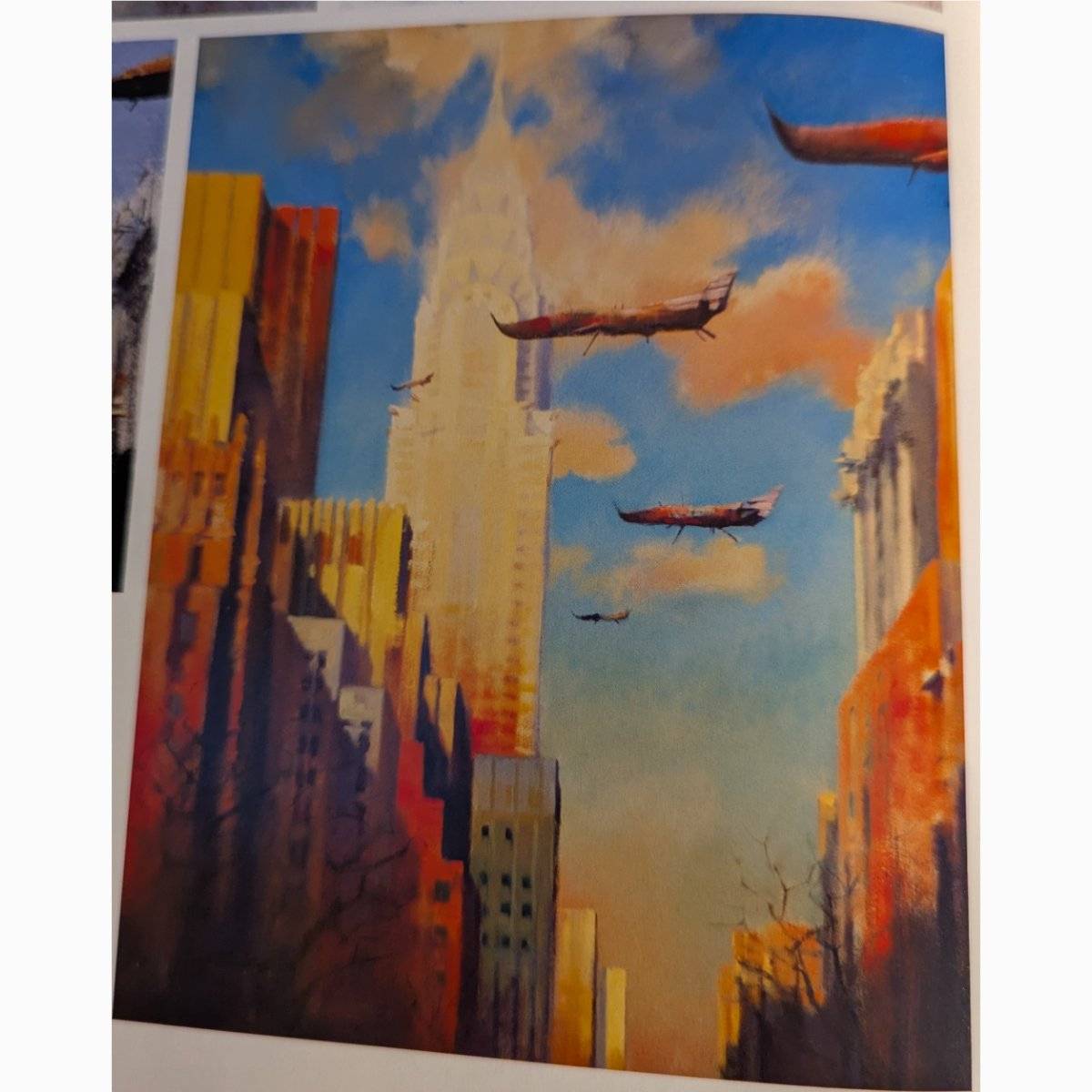
Robotswithpersonality 3/3 If you get a chance, at least take a flip through to appreciate that sci fi cover art doesn't have to bow to the prominent 'dark, sharp, cold' aesthetic. 5d
8 likes2 comments
blurb
Robotswithpersonality
post image

Last look: toasty alien landscapes. 🔥🐦‍🔥

blurb
Robotswithpersonality
post image

Does anybody else see a happy little bug?

Texreader Yep that‘s the first thing I thought! 6d
Dilara I do! 6d
11 likes2 comments
blurb
Robotswithpersonality
post image

Like the palette of an autumn day brushed over the scene of new visitors. 🍂🍁

blurb
Robotswithpersonality
post image

You know that quote from Last Holiday, where Queen Latifah's character is admiring the hotel and asks : “don't that ceiling ever just make you want to cry?“
THAT'S how I feel about John Harris's impressionist sci fi art. Forgive the genre pun, but I find a lot of typical, modern sci fi art to be alienating. It's sharp and cold. Even if the subject matter is about what is unknown, I need to know there can be warmth and softness and colour.

11 likes1 stack add
blurb
RaeLovesToRead
post image

💙